
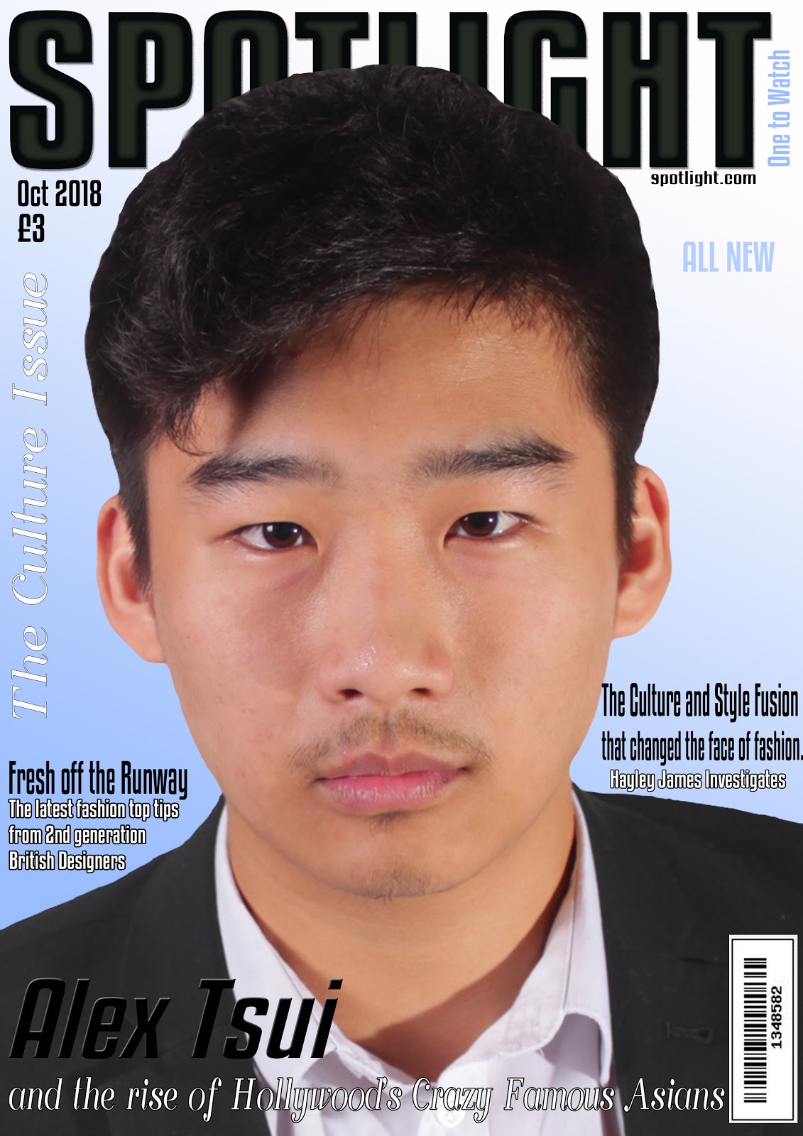

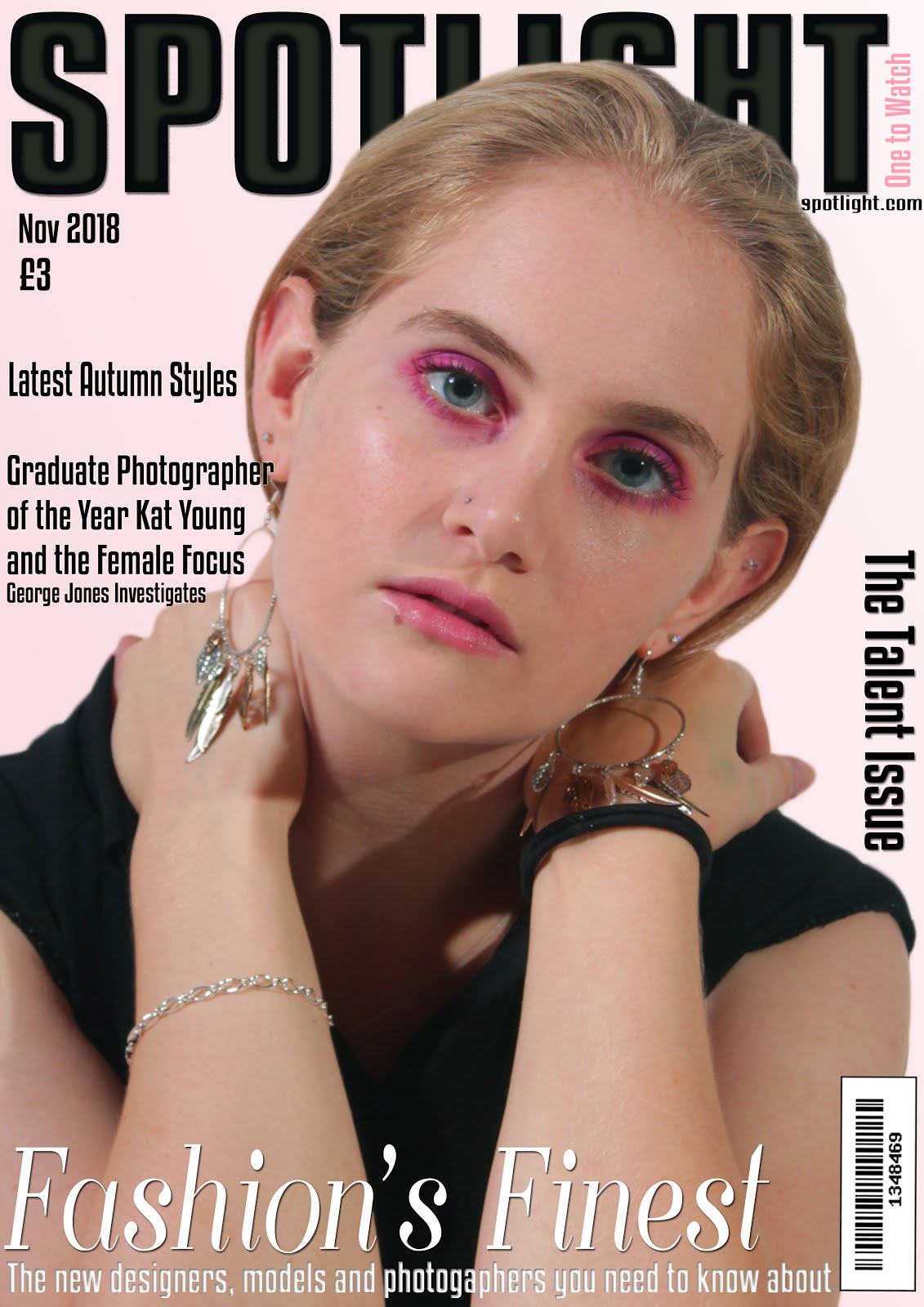

The cover of a magazine is used to highlight the magazine's intend target audience, the genre of the magazine, the magazine's brand identity and house style and to convince consumers to buy the magazine. Some common conventions that fashion magazine covers have are:
- a main image of a model- this will often show the magazine's brand identity and highlight to the reader the genre and intended target audience of the magazine.
- a masthead- a key part of the magazine's branding and makes the cover instantly recognisable. It is found at the top of the page in a bold font and will often go behind the model in the focal image.
- cover lines- the number of these on the cover varies depending on the style. More will suggest that the magazine is packed with content, while less will show the magazine as having a sophisticated style and draw more attention to the cover image. They will often be in the same font as the masthead with the exception of key words.
- a date line- often found by the masthead.
- price line- often found by the masthead.
- a tagline- will highlight the magazine's brand identity and editorial philosophy. This includes the intended audience and attitude of the magazine as well as the outlook and values held.
- a set typography- used across different issues of the magazine and are a key part of the house style. This font will linked to that magazine and can be designed to show the magazines style. A serif font, with decorative lines on letters, can be used to give a more formal and traditional feel to a magazine, whereas a sans serif font, without these decorative lines, can suggest that the magazine has a more modern or contemporary feel. Fonts can be used to lend a masculine or feminine feel to a magazine. There will often be use of more than one font on the cover of each magazine issue.
- a background- these are often a plain colour with a gradient. They can also be a blurred location shot, or will be a clear image but with a very clear colour scheme. They are occasionally a plain colour with a border.
- careful placement of elements- the masthead is found at the top of the page, often behind the main image which takes up most of the cover. The cover lines are the found down the side of the main image and along the bottom of the cover.
- direct address- by making it appear that the model is looking directly at the reader intensity is added and a connection between the reader and model is created, compelling the reader to purchase the magazine.
- a clear colour scheme- a clear colour scheme can be used across covers of a magazine or to add something new to each issue. It is also used to link different ideas on the cover together.
- syntagm- a combination of signs working together to create an idea. The use of colour can often be used to combine ideas, which Barthes use of semiotics suggests is the second order of significance for the reader to decode. For example, the same shade of pastel pink could be used on text and the model's clothes and make-up to suggest that she is a symbol of delicate femininity.
- a link to the website- to encourage readers to look for more content online.
- a bar code- often found in the bottom right corner.
- intertextuality- a link to other media forms familiar to the reader, increasing their interest and attachment to the media product making use of intertextuality.
- thematic cross-over- where the magazine will bring in other areas that are not directly focused on the magazine's subject. Many fashion magazines will include elements of lifestyle, music or news.


- A main image,
- a masthead with a mix of a modern sans serif font and a more traditional serif font,
- a date line,
- a price line,
- a plain colour background with a gradient,
- a web address,
- cover lines running down the sides of the cover,
- a bar code,
- a head line that runs across the bottom of the cover,
- direct address,
- intertextuality,
- thematic cross-over.
The contents page of a magazine is used to show the reader the contents of the magazine and make the magazine easy to navigate. By informing the reader of the contents, it may convince them to buy the magazine. Some common conventions that fashion magazine contents pages have are:
- a grid layout with lists of articles and page numbers.
- white space- there can be lots to give the magazine a clean and sophisticated feel or very little with lots of images to fill the space to make the magazine feel busy and full of content.
- a main image- often one large main image with the contents running down the side.
- a masthead- will contain a large 'contents' heading and some may have the magazine's masthead running along the top or down the side.
- small images surrounding the main image.
- images cropped in shapes- like circles rather than a standard rectangular images. These may be cut out images of clothing.
- the contents being arranged into categories such as fashion and lifestyle.
- they can be a single or double page spread.
- a web address or information on how to subscribe to the magazine.


On my own contents pages I wish to use the following conventions:
- a grid layout,
- lots of white space for a clean and sophisticated look,
- a main image,
- they will use a single page,
- a 'contents' masthead,
- my magazine masthead,
- the articles and page numbers running down the right hand side and bottom of the page,
- a web address.
The website home page of a magazine is used to provide the audience with information about the magazine and encourage them to buy it. They
will be able to read articles and view images in one unlimited space and will
be able to interact with and subscribe to the magazine. The website should
reflect the style of the magazine and ‘reinforce
and promote the brand identity’ and ideology of the magazine. It should
provide social media links and ways for the audience to share their views,
which will appeal to my ‘culturally sophisticated’
target audience.They are also a good space for advertisements.
Some common conventions that fashion magazine website home
pages have are:
- a masthead at the top of the page,
- a multitude of different images,
- a main navigation bar at the top of the page beneath the masthead,
- links to different pages of the website,
- social media links,
- a footer with options for subscription, information and contact links,
- audio-visual content,
- text with the same font as used in the magazine masthead for headers,
- links to articles,
- the use of lots of white space and a grid format,
- a search bar,
- a top stories section,
- advertising, often in the form of banners or skins,
- a landing page,
- opportunities to purchase the magazine.
Vogue's website home page and fashion pages.


Cosmopolitan's website home and style pages.


Harper's Bazaar website's landing page, home page and fashion page.


Glamour website's fashion page.

Many of these conventions can often be found on other pages of the website as well as the home page.
On my website I intend to include the following conventions:
The social media pages of a magazine are often found linked to the website. They allow the audience to interact with and engage with the magazine's content, encouraging them to buy the magazine.On my website I intend to include the following conventions:
- a main navigation bar at the top of the page beneath the masthead,
- links to different pages of the website,
- the magazine's tagline,
- social media links,
- a footer with options for subscription, information and contact links,
- audio-visual content,
- text with the same font as used in the magazine masthead for headers,
- links to articles,
- lots of white space and a grid format,
- a search bar,
- a landing page,
- a masthead at the top of the page,
- a multitude of different images,
- opportunities to purchase the magazine.
Some common conventions of magazine social media pages are:
- the cover of the current issue,
- images from current articles,
- links to the website,
- competitions,
- a profile picture including the magazines title,
- use of hashtags,
- banners with an image from current issue,
- gives viewers an opportunity to like and comment.
A post from Vogue's Instagram.

Vogue's twitter account.

On my own magazine's social media pages, I will include:
- the cover of the current issue,
- images from current articles,
- links to the website,
- a competition,
- a profile picture including the magazines title,
- use of hashtags,
- banners with an image from current issue,
- gives viewers an opportunity to like and comment.
No comments:
Post a Comment