My website

My website
Click here to access my website

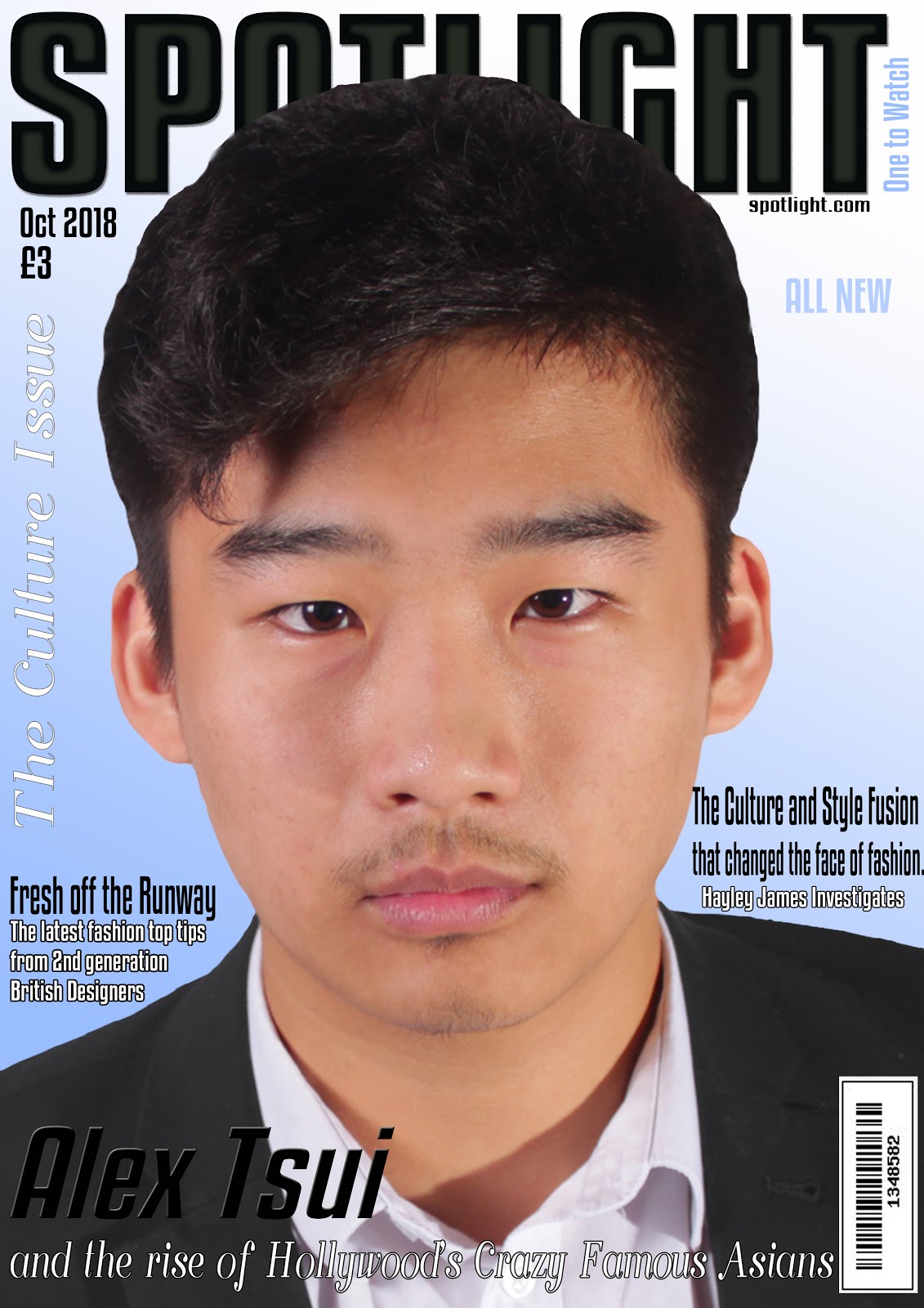
My magazine cover: Edition 1

My magazine contents page: Edition 1

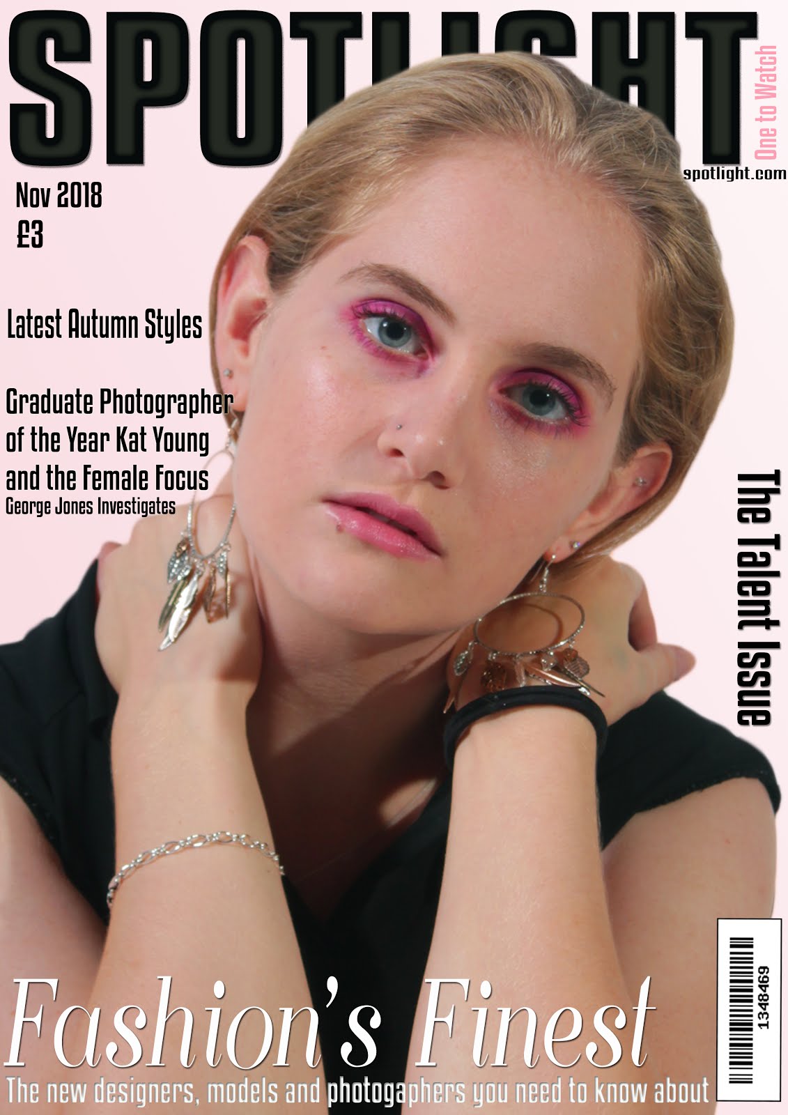
My magazine cover: Edition 2

My magazine contents page: Edition 2

Saturday, 27 October 2018

POST 7: MAGAZINE EDITION 2: COVER AND CONTENTS PAGE

In this post I will provide the planning behind the second issue of my magazine's cover and contents page as well as the inspiration behind it.

Below is the cover that inspired the main image and layout of my own magazine cover.

Below is a draft of the layout of the cover of my magazine's second issue.

Below is a mock up of the front cover of my magazine's second issue.
Below is a draft of the layout of this issue's contents page.
Below is the mock-up for this issue's contents page.
Below is a shoot board with my casting and costume choices.
The cover page of my second issue will share the minimalist and sophisticated house style of my production as well as including the diversity that is part of my brand's ideology, through the main feature of a female photographer.

Below is the first copy of the cover page.

Upon reviewing this, my teacher suggested that I could;
  • include magazine strapline,
  • make sure that there is reference to a male presence,
  • remove 'all new' as it is the second edition,
  • add some colour variation to the text,
  • make the text more visible,
  • make the image more saturated.
I responded to this review by;
  • including the magazine strap line to the right of my masthead,
  • including a sub line that references a male reporter,
  • made the strap line a pink to add colour variation and match the background,
  • removed 'all new',
  • made the main image more saturated,
  • added effects to the text to make it more visible.
Below is my final cover page, having made use of this review.
Below is the first copy of the contents page.
Upon reviewing this, my teacher suggested that I could;
  • ensure that the sections are in the same order across the two contents pages,
  • add colour variation to the text,
  • check industry conventions,
  • ensure that there are enough articles that capture male interest.
I responded to this review by;
  • adjusting the order of the sections to match the other contents page,
  • made the sub lines a grey colour to add variation,
  • included text outlining the cover pages photography, including details on the photographer, model and costume. 
Below is my final contents page, having made use of this review.

Thursday, 25 October 2018

POST 6: MAGAZINE EDITION 1: COVER AND CONTENTS PAGE

In this post I will provide the planning behind the first issue of my magazine's cover and contents page as well as the inspiration behind it.

Below is the cover that inspired the main image and layout of my own magazine cover.

Below is a draft of the layout of my magazine front cover.
Below is a mock up of my magazine front cover.
Below is a draft of the layout of my contents page.
Below is a mock-up of my contents page.
Below are shoot boards with my casting and costume choices.

The cover page of my first issue will share the minimalist and sophisticated house style of my production as well as including the diversity that is part of my brand's ideology. It will converge with the other products as the cover article will be found on my website home page and the cover itself will be found on all of my social media platforms.

Below is the first copy of the cover page.

Upon reviewing this, my teacher suggested that I could;
  • include the magazine strap line,
  • include more reference to a female presence,
  • include some more colour variation of the text,
  • make sure that cover lines are the same size,
  • make the text of the cover lines more visible.
I responded to this review by;
  • including the magazine strap line to the right of my masthead,
  • including a sub line that references a female reporter,
  • made the 'all new' and strap line a blue to add colour variation and match the background,
  • adjusted the size of the cover lines,
  • added effects to the text to make it more visible.
Below is my final cover page, having made use of this review.

Below is the first copy of the contents page. 


Upon reviewing this, my teacher suggested that I could;
  • include some colour variation in the text,
  • check to ensure that I haven't missed any industry conventions,
  • ensure that there are enough articles targeting each gender,
  • ensure that the language used in the cover lines is powerful,
  • ensure that the sections are in the same order on both contents pages. 
I responded to this review by;
  • adjusting the order of the sections to match the other contents page,
  • made the sub lines a grey colour to add variation,
  • included text outlining the cover pages photography, including details on the photographer, model and costume,
  • included more powerful language in my cover lines.
Below is my final cover page, having made use of this review.


Thursday, 18 October 2018

POST 5: PROPOSAL/RESPONSE TO BRIEF

In this post, I shall outline the demands of the brief and state how I am going to respond to them in my own production.

The product is the first two editions of a new fashion magazine. It is being produced by an independent production company and launched by Bauer and is intended to be sold in retailers. Its target audience is a culturally sophisticated, 16-25 class AB demographic and this must be reflected in the diverse range of fashion issues and styles included in the magazine. There must also be a website that promotes the magazine to the target audience and enables them to interact with the content. There must be a clear sense of branding across the two products.

The two magazine covers and contents pages must include:
  • four different main images,
  • using original photography,
  • editing of photos, text, graphics, typography and layout,
  • written text including masthead, cover lines, selling lines, headlines, caption, subtitles and copy, 
  • a different setting for each cover,
  • different material on each contents page,
  • at least two models from at least two different social groups,
  • a call to action pointing readers to the website. 
The website homepage and linked page must include:
  • at least two original images that promote and reinforce the brand identity of the magazine,
  • appropriate conventions of website design,
  • text introducing the main features of the online website,
  • working links from the homepage to the other page,
  • a range of appropriate media techniques,
  • original audio or audio-visual content.
Below is an overview of my response to the brief and some of the decisions that I have made surrounding my own production. 

Title: Spotlight
Tagline: One to watch
My magazine will be inclusive of all genders, with focus on power, pride and independence as well as including a range of ethnicity and sexuality, making the magazine a true representation of diversity.
Independent Production Company: AR Magazines
Focused on creating high quality magazines with unique and exciting features that break from traditional ideals of print media.

Overview of Magazine Issue 1
My first magazine issue will be the culture issue and will feature a MCU of an Asian male model in a suit, looking directly into the camera. He will be on a plain colour background with a gradient. The headline will include an intertextual reference to the film 'Crazy Rich Asians', as the model is an actor in the film and the cover lines will be focused on fashion with a reference to a female presence in order to present the magazine's unisex nature. The contents page will include cover lines that follow the theme of the culture issue and these will be sorted into four sections; On the Cover, Fashion, Beauty and News. The contents page will have three images; one of an Asian female against a wall background, one of the same male found on the cover of the magazine and a final image of an item of clothing. Both cover and contents page will have a clear and sophisticated style and will share the same fonts and masthead. Below is the inspiration for my first cover.


Overview of Magazine Issue 2
My second magazine issue will be the talent issue and will feature a MCU of female model in a black shirt, looking directly into the camera. She will be on a plain colour background. The headline will include a reference to emerging talent in fashion design and photography, as the model is a promising female photographer and the cover lines will be focused on fashion with a reference to a male presence in order to present the magazine's unisex nature. The contents page will include cover lines that follow the theme of the talent issue and these will be sorted into four sections; On the Cover, Fashion, Beauty and News. The contents page will have two images; one of the same female found on the cover of the magazine and another image of an item of clothing. Both cover and contents page will have a clear and sophisticated style and will share the same fonts and masthead. Below is the inspiration for my second cover.


Overview of my Magazine's Homepage
My magazine website's homepage will include the magazine's masthead at the top of the page to clearly establish the Spotlight identity. Beneath this there will be buttons, which lead to my websites other pages and links to the magazine's social media pages. There will be three articles on this page, each with an image, a headline and copy. The first will be an article about the cover star of the first magazine issue, the second will be on the LGBT+ community and fashion, and the final one will be on the latest fashion brand releases. Below is the home page that has inspired my own.


Overview of my Magazine's Second Page
My Magazine website's second page will be the website's fashion page and will include the magazine's masthead at the top of the page to clearly establish the Spotlight identity. There will be a large banner underneath navigation bar, introducing it as the fashion page. There will be two articles that link to each other on this page, each with a headline and copy. The first will be an article on street style, with images of three models and the second will be audio-visual content in the form of a behind the scenes video of the above article. Below is the fashion page that has inspired my own.


Digital Convergence and Brand Identity
My production will be digitally convergent due to the integrated nature of all of my online spaces, they will all link to each other. They will also link by including the same images and articles so they will be working together synergistically in order to create media storm around the articles. They will also share articles that are found in the magazine, and the front cover of the current issue will be available to view on all online platforms to encourage the audience to purchase the magazine. My production will show a strong sense of brand identity through the use of a minimalist style across all of the products and through the use of the same masthead on all of my print and online products. The brand identity of challenging the norms of cultural expectations, such as the break from 'white beauty' in my first issue, will also be present in all of my products, clearly showing the brands values. Below are some examples of digital convergence that have inspired my own production.


Tuesday, 9 October 2018

POST 4: REPRESENTATION

In this post I will talk about the representation of different social groups in magazines and how I will use this information in the creation of my own magazine.

The representation of the female and male identity is an important part of fashion magazines as the magazine gives a guide of how to look and behave as well as shaping audience ideas of what it means to be a man or woman. Magazines do this through the pushing of common gender stereotypes found in society, however the 'culturally sophisticated' target audience will look for a magazine that challenge these stereotypes and break the boundaries of gendered fashion through the use of androgynous looks and combining these with feminist ideas. The representation of gender is a key part of a magazine's brand identity and can often be seen in the tagline, for example Cosmopolitan's is 'for fun, fearless females' which suggests that readers are strong and confident women.

The following Cosmopolitan cover featuring singer Kesha both reinforces and contradicts female gender stereotypes. The use of the pastel blues and pinks in her dress, the background and the text present the idea of fragile and delicate femininity focused on appearance and style, which suggest that Kesha is a fashionable and delicate woman. However use of costume and text contradict this representation. The use of the studded leather jacket suggests that Kesha is a fierce and bold person, whose opinion cannot be contained. This along with the text claiming the magazine has 'the interview the world wanted' in reference to her sexual abuse claims against her producer, suggests that Kesha is a strong woman able to come forward from an abusive situation and encourages other women to do the same. The combination of representations in this cover show Kesha as both a strong woman and a beautiful and feminine one, which encourages the reader that they can be both, bringing forth ideas of a new and highly relevant woman.

The representation of race and ethnicity on magazine covers is also a highly relevant issue currently with the lack of representation of people of colour on magazines being highlighted. Gerbner would argue that the exposure of magazine readers to ideas of what is fashionable and beautiful over a long period of time has shaped and influenced the way they perceive fashion, guiding them to accept white ideals of beauty as the norm. The 'culturally sophisticated' target audience would look for a magazine that represents a range of ethnicities, whilst moving away from a focus of white beauty and the use of the exotic other. This will be especially important to the target audience after the release of September 2018 issues of Vogue, Elle, Marie Claire and Porter, which all featured women of colour.

In my own magazine I will use representation to appeal to my target audience through the use of a tagline that is inclusive of all genders and presents the readers as power, proud and independent, as well as including a range of ethnicity, gender and sexuality in the models in my magazine, to challenge traditional stereotypes and focus on true diversity.

Sunday, 7 October 2018

POST 3: CODES AND CONVENTIONS

In this post I will explore the codes and conventions of magazine covers, contents pages and websites in order collect ideas on which conventions I wish to follow in the creation of my own magazine.

The cover of a magazine is used to highlight the magazine's intend target audience, the genre of the magazine, the magazine's brand identity and house style and to convince consumers to buy the magazine. Some common conventions that fashion magazine covers have are:

  • a main image of a model- this will often show the magazine's brand identity and highlight to the reader the genre and intended target audience of the magazine. 
  • a masthead- a key part of the magazine's branding  and makes the cover instantly recognisable. It is found at the top of the page in a bold font and will often go behind the model in the focal image. 
  • cover lines- the number of these on the cover varies depending on the style. More will suggest that the magazine is packed with content, while less will show the magazine as having a sophisticated style and draw more attention to the cover image. They will often be in the same font as the masthead with the exception of key words. 
  • a date line- often found by the masthead.
  • price line- often found by the masthead.
  • a tagline- will highlight the magazine's brand identity and editorial philosophy. This includes the intended audience and attitude of the magazine as well as the outlook and values held. 
  • a set typography- used across different issues of the magazine and are a key part of the house style. This font will linked to that magazine and can be designed to show the magazines style. A serif font, with decorative lines on letters, can be used to give a more formal and traditional feel to a magazine, whereas a sans serif font, without these decorative lines, can suggest that the magazine has a more modern or contemporary feel. Fonts can be used to lend a masculine or feminine feel to a magazine. There will often be use of more than one font on the cover of each magazine issue. 
  • a background- these are often a plain colour with a gradient. They can also be a blurred location shot, or will be a clear image but with a very clear colour scheme. They are occasionally a plain colour with a border. 
  • careful placement of elements- the masthead is found at the top of the page, often behind the main image which takes up most of the cover. The cover lines are the found down the side of the main image and along the bottom of the cover. 
  • direct address- by making it appear that the model is looking directly at the reader intensity is added and a connection between the reader and model is created, compelling the reader to purchase the magazine. 
  • a clear colour scheme- a clear colour scheme can be used across covers of a magazine or to add something new to each issue. It is also used to link different ideas on the cover together. 
  • syntagm- a combination of signs working together to create an idea. The use of colour can often be used to combine ideas, which Barthes use of semiotics suggests is the second order of significance for the reader to decode. For example, the same shade of pastel pink could be used on  text and the model's clothes and make-up to suggest that she is a symbol of delicate femininity. 
  • a link to the website- to encourage readers to look for more content online.
  • a bar code- often found in the bottom right corner.
  • intertextuality- a link to other media forms familiar to the reader, increasing their interest and attachment to the media product making use of intertextuality.
  • thematic cross-over- where the magazine will bring in other areas that are not directly focused on the magazine's subject. Many fashion magazines will include elements of lifestyle, music or news.
On my own fashion magazine covers I wish to use the following conventions:

  • A main image, 
  • a masthead with a mix of a modern sans serif font and a more traditional serif font,
  • a date line, 
  • a price line,
  • a plain colour background with a gradient,
  • a web address,
  • cover lines running down the sides of the cover,
  • a bar code,
  • a head line that runs across the bottom of the cover,
  • direct address,
  • intertextuality,
  • thematic cross-over.  

The contents page of a magazine is used to show the reader the contents of the magazine and make the magazine easy to navigate. By informing the reader of the contents, it may convince them to buy the magazine. Some common conventions that fashion magazine contents pages have are:

  • a grid layout with lists of articles and page numbers.
  • white space- there can be lots to give the magazine a clean and sophisticated feel or very little with lots of images to fill the space to make the magazine feel busy and full of content.
  • a main image- often one large main image with the contents running down the side.
  • a masthead- will contain a large 'contents' heading and some may have the magazine's masthead running along the top or down the side. 
  • small images surrounding the main image.
  • images cropped in shapes- like circles rather than a standard rectangular images. These may be cut out images of clothing.
  • the contents being arranged into categories such as fashion and lifestyle.
  • they can be a single or double page spread.
  • a web address or information on how to subscribe to the magazine.


On my own contents pages I wish to use the following conventions:
  • a grid layout,
  • lots of white space for a clean and sophisticated look,
  • a main image, 
  • they will use a single page,
  • a 'contents' masthead,
  • my magazine masthead,
  • the articles and page numbers running down the right hand side and bottom of the page,
  • a web address.

The website home page of a magazine is used to provide the audience with information about the magazine and encourage them to buy it. They will be able to read articles and view images in one unlimited space and will be able to interact with and subscribe to the magazine. The website should reflect the style of the magazine and ‘reinforce and promote the brand identity’ and ideology of the magazine. It should provide social media links and ways for the audience to share their views, which will appeal to my ‘culturally sophisticated’ target audience.They are also a good space for advertisements.
Some common conventions that fashion magazine website home pages have are:
  • a masthead at the top of the page,
  • a multitude of different images,
  • a main navigation bar at the top of the page beneath the masthead,
  • links to different pages of the website,
  • social media links, 
  • a footer with options for subscription, information and contact links,
  • audio-visual content,
  • text with the same font as used in the magazine masthead for headers,
  • links to articles,
  • the use of lots of white space and a grid format,
  • a search bar,
  • a top stories section, 
  • advertising, often in the form of banners or skins,
  • a landing page,
  • opportunities to purchase the magazine.
Vogue's website home page and fashion pages.


Cosmopolitan's website home and style pages.


Harper's Bazaar website's landing page, home page and fashion page.


Glamour website's fashion page. 

Many of these conventions can often be found on other pages of the website as well as the home page.
On my website I intend to include the following conventions:
  • a main navigation bar at the top of the page beneath the masthead,
  • links to different pages of the website,
  • the magazine's tagline,
  • social media links, 
  • a footer with options for subscription, information and contact links,
  • audio-visual content,
  • text with the same font as used in the magazine masthead for headers,
  • links to articles,
  • lots of white space and a grid format,
  • a search bar,
  • a landing page,
  • a masthead at the top of the page,
  • a multitude of different images, 
  • opportunities to purchase the magazine.
The social media pages of a magazine are often found linked to the website. They allow the audience to interact with and engage with the magazine's content, encouraging them to buy the magazine.
Some common conventions of magazine social media pages are:
  • the cover of the current issue,
  • images from current articles, 
  • links to the website, 
  • competitions,
  • a profile picture including the magazines title,
  • use of hashtags,
  • banners with an image from current issue, 
  • gives viewers an opportunity to like and comment.

A post from Vogue's Instagram.

Vogue's twitter account.

On my own magazine's social media pages, I will include: 
  • the cover of the current issue,
  • images from current articles, 
  • links to the website, 
  • a competition,
  • a profile picture including the magazines title,
  • use of hashtags,
  • banners with an image from current issue, 
  • gives viewers an opportunity to like and comment.

Monday, 1 October 2018

POST 2: INDUSTRY

In this post, I will explore the media industry surrounding magazines and how this will effect the choices I make in my own production.

Most magazines are financed through dual revenue streams, where they get their revenue from both the cover price of the magazine as well as from advertising. As the majority of the revenue comes from advertising, it is important that the magazine is an attractive platform for advertisers. This is done by making the magazine appeal to a large audience to make sure the magazine has a large circulation and therefore readership, who will view the advertisements. A way in which magazines will create a boost in circulation in order to attract advertisers is to reduce the cover price of the magazine as this broadens it's reach. When Hearst UK reduced Cosmopolitan's cover price from £3.80 to £1, the circulation increased by 50% making it a very attractive advertising prospect. The cost of magazines vary depending on their quality and target audience. High quality fashion magazine Vogue costs about £5, whereas lower quality magazines like Glamour retail for £2. Grazia, a Bauer magazine, costs £2.20. Independent magazines are often more expensive than mainstream magazines. To reflect the prize of an independently produced magazine widely distributed for a young adult target audience, my magazine will cost £3.

Many of the magazines available for sale are produced and distributed by a small number of  large companies driven by profit and power, with many having undergone mergers with other companies to remove competition. This horizontal integration allows companies to cater to a wide range of audiences by launching new titles and to allow the company to diversify into other areas of the media. The media group that will be distributing my magazine, Bauer, claim to be 'the UK's most influential media brand network' and have branches in magazines, digital media, TV and radio. The magazines that they already produce and distribute are Take a Break, Bella, TV Choice, Empire, Grazia and Heat, as well as other magazines for smaller audiences such as Classic Car Weekly, Model Rail and Practical Photography.

My own magazine is created by 'an independent media production company' and then being 'launched by Bauer'. By assigning an independent production company to a large distributor, a variety of new, unique, quality content is introduced to the market, however it is able to be distributed quickly and in large quantities to ensure a larger reach than if the magazine was independently distributed as well as produced. As Bauer 'intends to sell the magazine in retailers', the magazine must be able to provide a unique and independent feel, whilst not becoming so unconventional that it loses its appeal to a large scale audience group.

Below is an image of the magazine selection in my local WHSmith. The majority of these are conventional mainstream magazines such as Vogue, GQ and Cosmopolitan, however there are also independently produced magazines like Dazed and The Gentlewoman. However, you would be unlikely to find these in smaller retailers.


One independent magazine, 'The Gentlewoman', is a high quality print magazine, which strays from regular fashion magazine conventions, to create a new and unique brand identity. This magazine is distributed, on a smaller scale than my magazine will be by magazine distributor 'Bruil & van de Staaij'.

This cover of Vogue follows fashion magazine codes and conventions, which would make it accessible and attractive to a large audience and will be able to be sold in retailers.

This cover of independent magazine The Gentlewoman does not follow magazine codes and conventions, meaning that it is targeted at a smaller scale niche audience. The use of the cigarette means that it is unlikely that this magazine could be sold in retailers.

A current trend in the magazine market is the increased presence of diversity and this can be seen on the covers of many September 2018 fashion magazines like Elle and Vogue, putting women of colour onto their front covers. I will try to follow this trend of increasing diversity by including a person of colour on one my own front covers.

With the movement of audiences online, it is becoming increasingly important to create a strong online and social media presence in order to keep the interest of the magazine's target audience and attempt to keep them buying the magazine. There must be a strong sense of brand identity across these products, through the use of a clear and unique house style and they must also be strongly digitally convergent with all platforms linking together and pushing towards the same goal of offering the audience an opportunity to purchase the magazine.

Regulation in magazines is provided by IPSO (Independent Press Standards Organisation) and members must publish an annual statement with any complaints and measures that have been taken to comply with the Editor's Code of Practice. This contains guidelines on issues such as accuracy, privacy, discrimination and how these things are affected by the public issue. One clause states that 'the press must take care not to publish inaccurate, misleading or distorted information or images'and this rule has had to adjust with changes in technology and the increased use of the airbrushing and digital manipulation of images in print.

In my magazine, I intend to give my magazine an independent feel, while ensuring it remains conventional enough that it is suitable for retail distribution by Bauer, as well as ensuring that I follow the guidelines provided by IPSO by not including smoking (as it could be seen to encourage smoking), alcohol, violence, nudity, swearing and  overt sexual behaviour.

Sunday, 30 September 2018

POST 1: AUDIENCE

In this post I will explore the target audience set in the brief and ideas on how I will create my magazine to reflect them and their interests. My target audience is a 'culturally sophisticated, 16-25 class AB demographic', who are 'media literate'.

This target audience is formed of educated young people who look for challenge in the media they consume. The AB social grade provided by the NRS (National Readership Survey) suggests that the target audience have a family background of managerial, administrative and professional jobs, so will have a relatively high disposable income. This means that the magazine will contain advertisements from more expensive brands. The NRS collect and provide data on readership and circulation as well as demographic variables such as age, sex, ethnicity and social grade. This information is used by magazines to group and categories their audiences to make their magazines attractive to advertisers. This is important as advertising is a key source of revenue for magazine companies.

             Vogue's print information on readership for advertisers from their media kit August 2018

The 'media literate' target audience will consume lots of their media on portable devices like phones and laptops, so enjoy to keep up with events and ideas on social media, therefore a strong online and social media presence is required in order to advertise my magazine to my target audience.

The 'culturally sophisticated' target audience will enjoy a fashion magazine with modern and relevant fashion and people which is different and interesting. They will want a challenge in what they read, possibly in the form of a challenge to the cultural norm in things like representations of gender, race and sexuality, as well as being strongly linked with activist ideas. My target audience look for media that gratifies both their need for entertainment and their need to be informed, whether this is focused on current affairs or the latest fashion trends.These magazines often have a niche, indie style, with an edgy and artistic style. Unisex magazines for this age group will often contain articles on fashion and music, with focus on street wear styles. This '16-25 class AB demographic' will likely be in higher education and enjoy the sharing of ideas, so will likely have a strong social media presence.


To reflect the interests of the target audience and therefore attract them to my magazine I will include modern fashions and include new and current representations of gender, sexuality and race, appealing to the audience's activist ideals of equality It will also have an artistic house style and will contain strong links between the magazine and its online and social media presence.